The Polished-First Myth: Why Rough Versions Have a Job
Rough versions reveal structure before surface details take over, helping you spot what a piece needs and decide where refinement will make a real difference.
You open a drawing file to adjust the spacing, then notice that the image may move and the headline may change. A rough version of a poster, story, or song can make that uncertainty visible without asking you to decorate it. Its job is not to preview a finished piece; it is to help you see how the parts behave together.
Polish changes what a viewer notices. Smooth lettering and careful shading can draw attention to the finish, while a plain arrangement puts the relationships on display. That difference makes rough work useful as an instrument of attention: it lets you look at sequence, emphasis, and proportion before those choices become harder to revise.
What can rough versions reveal?
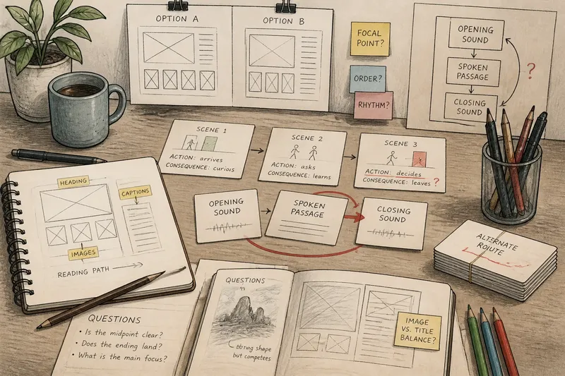
A rough version is a model of relationships. A poster might use rectangles for its image, headline, and date. A story might use index cards with a scene’s action and consequence. A song might be a voice memo with a melody and a note about where the chorus begins. None needs to resemble the final form; each needs to make its central relationship inspectable.
Try choosing the representation that removes irrelevant decisions. If you are arranging a sequence, cards can be moved more easily than paragraphs. If you are testing the balance of a page, boxes in a Google Slides deck may be clearer than finished illustrations. If you are shaping a melody, a phone recording can preserve its contour without committing you to an arrangement.
The rough form also changes the kind of judgment you can make. A scene card can show that a character’s decision arrives too early; it cannot tell you whether the dialogue sounds natural. A black-and-white layout can show competing blocks of attention; it cannot settle a color palette. Use the model for the decisions it can actually display.
How can you make a rough version without turning it into a preview?
Choose a small set of materials that makes the work easy to rearrange: pencil and index cards, plain text in a document, removable tape, or simple frames in a layout app. Leave visible gaps, labels, and questions where the work is unresolved. The point is not to imitate a finished surface with cheaper tools; it is to keep the structure legible.
Imagine you are making a handout for a small exhibition. You place a heading, three artwork images, and captions on a single page using paper rectangles and handwritten labels. The captions crowd the images, so you move them into a narrow column; the page now has a clearer reading path. That result gives you a reason to refine the layout, but it does not yet answer which typeface or colors belong there.
In another medium, the same distinction might mean writing a play’s entrances and exits on cards rather than drafting polished dialogue. If two characters appear to have no reason to meet, the cards reveal the gap. You can decide whether to change the sequence or add a connecting event before spending time on the sound of each line.
What choices belong in the rough stage?
Use rough work for choices that affect the whole: order, grouping, focal point, rhythm, or the relationship between a part and its setting. Leave local refinements—word choice, texture, shading, transitions, and type styling—for later if they depend on those larger decisions.
This is not a rule against making something attractive early. A line of color or a musical phrase can be part of the structure if it carries meaning. The useful distinction is whether a detail helps you judge the arrangement or merely makes an unsettled arrangement feel more convincing.
When you discover a detail that might affect the structure, keep it, but mark its status. Put a question mark beside a possible ending, use a different pencil color for an alternate route, or add a comment in the margin. A visible reservation is easier to revisit than a choice that has been polished into seeming inevitable.
When is a rough version ready to change?
A rough version is ready for revision when it lets you point to a relationship that is not working. “The second scene repeats the first” or “the title competes with the image” gives you something to alter. “It feels wrong” may be a real response, but it needs another look before it can direct a useful change.
Then change the smallest structural element that could address the problem. Move a card, remove a competing block, or shift the order of two sections. Compare the new arrangement with the old one, and notice what changed: perhaps the sequence is clearer, but a transition now feels abrupt. That tradeoff is useful information, not a demand to return to the first version.
Say you have a short audio piece with three sections: an opening sound, a spoken passage, and a closing sound. You place those labels on three cards, then notice that the closing sound arrives before the spoken passage has reached its point. Moving the spoken section ahead of the closing sound makes the ending feel more earned, but the new order leaves a longer pause in the middle. You have learned both the better sequence and the next question to consider: whether that pause belongs or needs a bridge.
What should you do when a rough version feels vague?
How much detail belongs in a rough version?
Include enough detail to make the decision in front of you visible, and leave out details that cannot affect it. Boxes and labels may be enough for a page layout; a story may need scene actions and consequences rather than finished prose.
Can rough work be shared with someone?
Yes, if you describe what the model is meant to show and ask about that feature. A listener can respond to the order of a spoken outline, for example, without being asked to judge its delivery or polish.
What if I keep refining small details?
Return to the part of the work that the current model is designed to expose. If you are changing a button color while the page’s image and headline may still move, switch back to plain boxes or pause until the larger arrangement is visible again.
Does a rough version need to be visual?
No. A spoken outline, a table of sections, a voice memo, or a sequence of notes can reveal relationships. Choose the form that makes the relevant parts easiest to compare.
How do you know when to leave the rough stage?
Move on when the main relationships are clear enough that further changes are choices of emphasis rather than attempts to repair a missing connection or confusing order. You may still prefer one arrangement, but you should be able to explain what the alternatives would change.
Before adding surface detail, check what that detail will help you decide. If type styling will clarify hierarchy, it belongs in the next pass. If it would only distract from an unresolved sequence, keep the plain model and revise the sequence first. Rough versions earn their place by making the next decision more visible, not by predicting exactly what the finished work will look like.